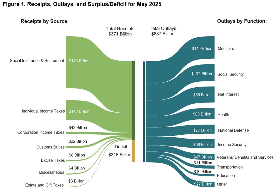
Vitor Pamplona on Nostr: This chart is everywhere these days. My question is why is the 148 billion so much ...
This chart is everywhere these days. My question is why is the 148 billion so much bigger than the 142B underneath it? And why doesn't the yellow 316B deficit take half of the left side, since it is about 50%? And why is the 316B yellow smaller than the 148B green? This is not how this chart is supposed to work.
Published at
2025-06-14 13:40:00Event JSON
{
"id": "7242fa0cb4bd987c3153efc8cd1a9fdb9846ecd3358d6723e7d3eb79588c4a00",
"pubkey": "460c25e682fda7832b52d1f22d3d22b3176d972f60dcdc3212ed8c92ef85065c",
"created_at": 1749908400,
"kind": 1,
"tags": [
[
"imeta",
"url https://media.ditto.pub/f9d1bc7e9a6e86a3512c2177ffda7fac0a654fcff5d374b63ebefe6463554972.jpeg",
"m image/jpeg",
"x f9d1bc7e9a6e86a3512c2177ffda7fac0a654fcff5d374b63ebefe6463554972",
"size 86477",
"dim 1111x764",
"blurhash UdPs|u%K~XIaxuRjRjxa^,WE9Yous;azofa_"
],
[
"client",
"Ditto",
"31990:15b68d319a088a9b0c6853d2232aff0d69c8c58f0dccceabfb9a82bd4fd19c58:ditto",
"wss://ditto.pub/relay"
]
],
"content": "This chart is everywhere these days. My question is why is the 148 billion so much bigger than the 142B underneath it? And why doesn't the yellow 316B deficit take half of the left side, since it is about 50%? And why is the 316B yellow smaller than the 148B green? This is not how this chart is supposed to work.\n\nhttps://media.ditto.pub/f9d1bc7e9a6e86a3512c2177ffda7fac0a654fcff5d374b63ebefe6463554972.jpeg",
"sig": "9fee8b4343bac5b27c72cd3cf36f07484e5a6ad96da0dd521cebb5f850f7984dbb412783969db1d9e1a92f9b954d1e42b8deeabfcea0c8732a8f798944eddf11"
}
