LePlebRoyale on Nostr: Oooh, that is pretty nice. ...
Oooh, that is pretty nice.
THE LOGO

I'm going to start promoting this because people keep asking for something that:
- is simple & recognisable
- literally anyone can draw in 3 seconds
- is NOT an ostrich
- shows that we're talking about a network
- fits nicely next to our competition's icons (Instagram, X, Facebook, YouTube, Google...)
- Pairs up well with the Bitcoin "B"
This logo has been doing the job for me for months and I still like it.
SVG files of several versions here 👉 https://w3.do/L6ZV6jBo
#nostrdesign #logo #branding
Sovereign Engineering (npub1s0v…rmq5)
zach (npub1zac…5dy5) hzrd149 (npub1ye5…knpr) franzap (npub1wf4…dgh9)
Gigi (npub1der…xzpc)
It kinda reminds me of the Noderunners Logo I made a few years ago. See:

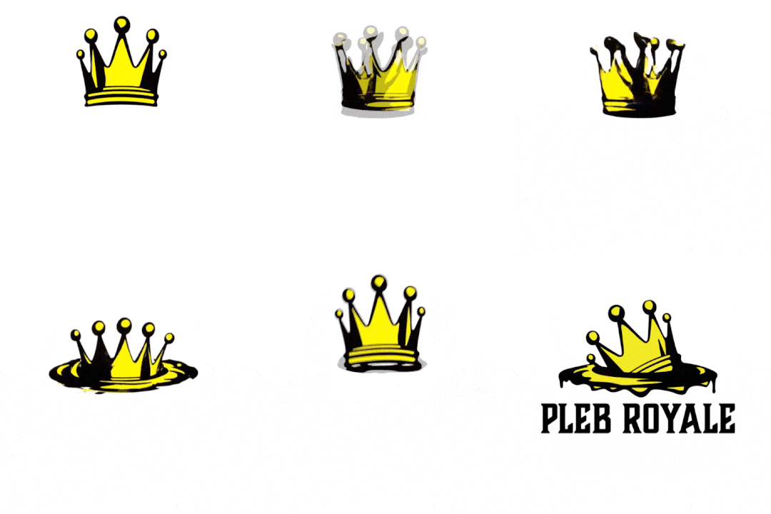
As for nostr, personally, I've been playing around with a more organic looking thing, seeing as the structure of the network itself is also pretty fluid and can be haphazardly approached.
This brought me to consider the art of calligraphy, inks, brushes, swooshes. natural feeling stuff.

Of course I did want to keep the nodules/nodes which led me to this bone-like structure. I think it is very fitting. Like so:

Leading me to:

If you try really hard, you may even still see an ostrich in it ;)
Let me know your thoughts.
Published at
2024-01-12 15:43:15Event JSON
{
"id": "abe323ae15396fbb94428014fdf24099c4b53007d48d2eede61ecd9c72ef1c90",
"pubkey": "c384de42c0e689c34a0aefa9c0ae516093d3d50ca0226fdb011435c8493922aa",
"created_at": 1705074195,
"kind": 1,
"tags": [
[
"e",
"3afe28f4e359073b88359d091fb65eb96000b82d66c512a5a65462eb0b76f6ca",
"",
"mention"
]
],
"content": "Oooh, that is pretty nice. \nnostr:note18tlz3a8rtyrnhzp4n5y3ldj7h9sqpwpdvmz39fdx233wkzmk7m9qtrh2hx \nIt kinda reminds me of the Noderunners Logo I made a few years ago. See: https://m.primal.net/HXdu.png\nAs for nostr, personally, I've been playing around with a more organic looking thing, seeing as the structure of the network itself is also pretty fluid and can be haphazardly approached. \nThis brought me to consider the art of calligraphy, inks, brushes, swooshes. natural feeling stuff. \nhttps://m.primal.net/HXeB.png\nOf course I did want to keep the nodules/nodes which led me to this bone-like structure. I think it is very fitting. Like so:\nhttps://m.primal.net/HXdw.png\nLeading me to:\nhttps://m.primal.net/HXdz.png\nIf you try really hard, you may even still see an ostrich in it ;)\nLet me know your thoughts.",
"sig": "551438d956e44ea9b97806d1392d7560c5e2c92ed59363c0b8daaaffa6bfcef6e9384bcf5d6b91e41621e66e4206c48e3877954ee916995d9b99c4ffd97b1dd9"
}


