Christian Selig on Nostr: One tricky design thing I've found with medium-sized interactive widgets is choosing ...
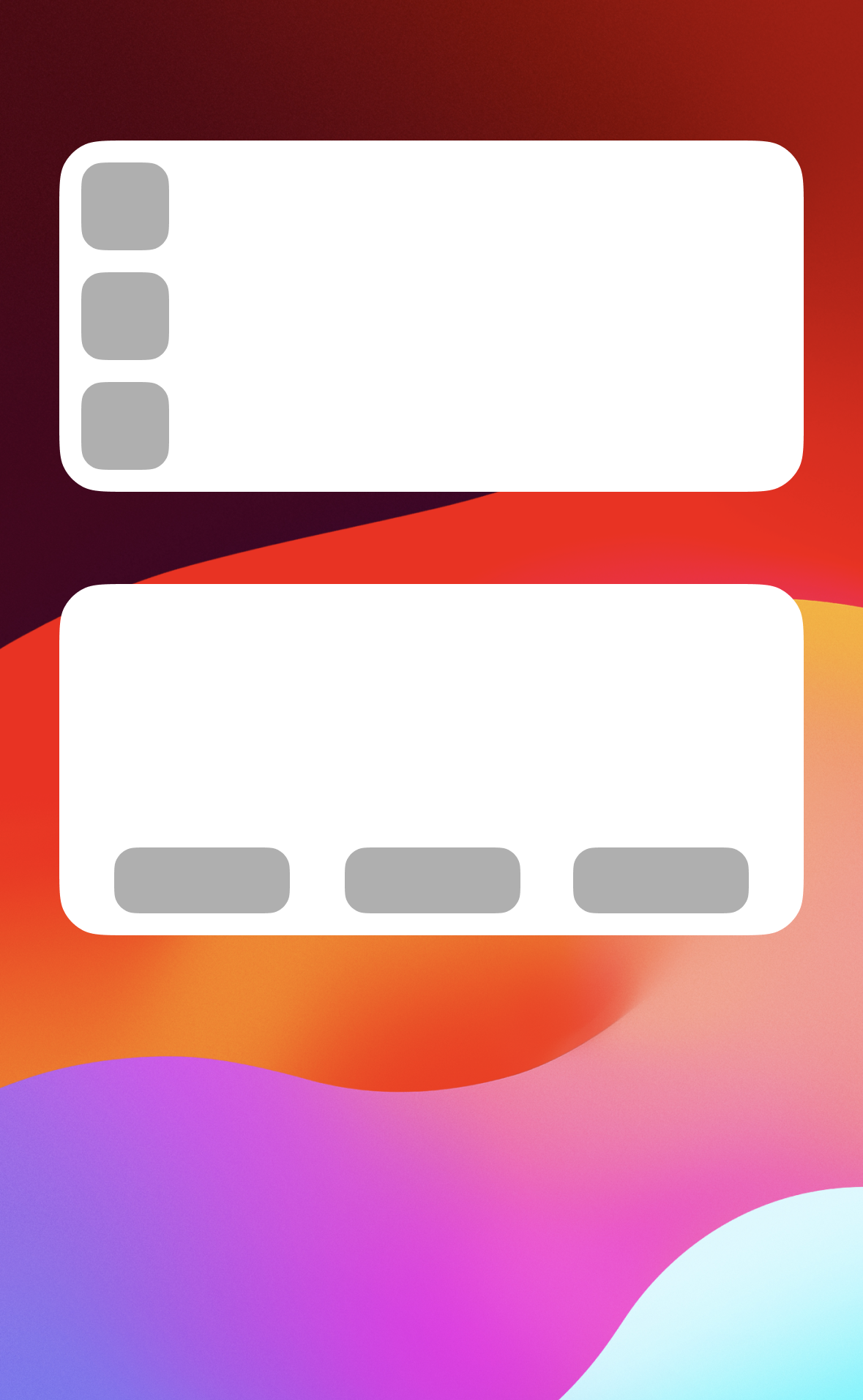
One tricky design thing I've found with medium-sized interactive widgets is choosing button placement. The sides feel better to me, but the asymmetry of that makes me slightly unsure

Published at
2023-08-16 00:03:14Event JSON
{
"id": "f83b65d673adcff137b60db6f44908e5822dcba6ca93aa08c8f14cfdb62796a2",
"pubkey": "de6adda4d139627ce8f9cf05ef27c7cd1de9895363e5f303667f761bec318716",
"created_at": 1692144194,
"kind": 1,
"tags": [
[
"proxy",
"https://mastodon.social/users/christianselig/statuses/110896361918781778",
"activitypub"
]
],
"content": "One tricky design thing I've found with medium-sized interactive widgets is choosing button placement. The sides feel better to me, but the asymmetry of that makes me slightly unsure\n\nhttps://files.mastodon.social/media_attachments/files/110/896/361/666/642/622/original/4138d806c4a7cf2e.png",
"sig": "5faa917194eb7bb2bb6b0cc2d6333a73ae394c59818b59043d9e8a7996c999a69857d242a02e0c99a2434d429c83e4ec5650755a86a5c7ec28b4f8a100e1eba8"
}


