Jack of all trades on Nostr: Take a look at this graph. It compares total annual CO₂ emissions of all ...
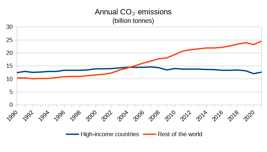
Take a look at this graph. It compares total annual CO₂ emissions of all high-income countries with emissions of the rest of the world.
The story here seems clear: high-income countries are reducing their emissions, but the rate of that reduction is way too slow and in practice gets erased by the emissions growth in developing nations.
#ClimateChange #ClimateJustice #ClimateCrisis

Published at
2023-10-21 19:40:12Event JSON
{
"id": "621dd30e4c10f5cd4531b61bbc11b9eecb0cc1d2d5c503509b559f6bc13808c6",
"pubkey": "7661cdf9eb02a684c4920d016c5973fac4fdfcf600ffe0a9018786e2b70ccb1b",
"created_at": 1697917212,
"kind": 1,
"tags": [
[
"t",
"climatecrisis"
],
[
"t",
"climatejustice"
],
[
"t",
"climatechange"
],
[
"proxy",
"https://mas.to/users/jackofalltrades/statuses/111274702470281875",
"activitypub"
]
],
"content": "Take a look at this graph. It compares total annual CO₂ emissions of all high-income countries with emissions of the rest of the world.\n\nThe story here seems clear: high-income countries are reducing their emissions, but the rate of that reduction is way too slow and in practice gets erased by the emissions growth in developing nations.\n\n#ClimateChange #ClimateJustice #ClimateCrisis\n\nhttps://media.mas.to/masto-public/media_attachments/files/111/274/680/482/451/223/original/98ecb8514ae0a402.png",
"sig": "d25aba7c15322a6c1f599cd7ab9ea8a59d7296e23d271fc2f0893c807026281be26411254b2e54a6e72f21407e0f5ac8a71b56b85b6f01965041f677384f23f1"
}

