Event JSON
{
"id": "ee25470a8effafc0729f346ab1dc5d867de5d9780dbf0a0be757bf62f20b46cc",
"pubkey": "fb45f982d24c6ddaaed012e28c2514ba7207a08cd738d52e27a5ef6827667900",
"created_at": 1717404344,
"kind": 1,
"tags": [
[
"p",
"715dc06230d7c6aa62b044a8a764728ae6862eb100f1800ef91d5cc9f972dc55",
"",
"mention"
],
[
"t",
"design"
],
[
"r",
"https://image.nostr.build/aab94e7aca1b890d86bf81006c547d60fe4256001c30461bfbb15c277a2832aa.jpg"
],
[
"r",
"https://image.nostr.build/5b65055a1adaf3e3141c8fdb16c5eb3c0781743e6e296198ada33e291650fd97.jpg"
],
[
"r",
"https://image.nostr.build/36a98a15ed17e641ff1bef30ceb1f4afac29a79ba97d624aa0f3dd5f55ff5241.jpg"
],
[
"r",
"https://image.nostr.build/4617fd9aa9375e787852de9ae5aa37e44cd698d99aa3a156cb4aa33ebe3e1a27.jpg"
],
[
"imeta",
"url https://image.nostr.build/aab94e7aca1b890d86bf81006c547d60fe4256001c30461bfbb15c277a2832aa.jpg",
"m image/jpeg",
"alt Various versions of We Distribute's current logo. \n\nText: \"Upsides: Glitchy, experimental, easily recognizable. Despite being visually jumbled, you can still recognize what it is. Looks cool.\n\nDownsides: logo does not actually convey any meaning. It looks cool, but the symbolism is shallow at best, and it doesn't really represent anything beyond the website. Despite some other visual elements of the site having a glitch aesthetic, the overall visual design is not actually glitchy, and looks more like print media.\"",
"x c8ba316176653e4411fd6d5c6d7b2204f8b972bd5f157ba06a95965eee75470f",
"size 134058",
"dim 1920x1357",
"blurhash rGO:@SayofRj-;xu?bfQxu00xuRjWBxuxuxuayt7?bayj[ofWBWBWBayay~qayxuofRjIURjayj[-;oft7t7RjM{RjWBofD%ofofofayWBj[ayof",
"ox aab94e7aca1b890d86bf81006c547d60fe4256001c30461bfbb15c277a2832aa"
],
[
"imeta",
"url https://image.nostr.build/5b65055a1adaf3e3141c8fdb16c5eb3c0781743e6e296198ada33e291650fd97.jpg",
"m image/jpeg",
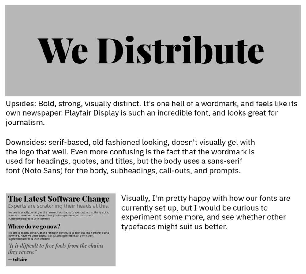
"alt A demonstration of We Distribute's current wordmark, with some discussion of fonts and how that assortment looks on a page.\n\nText: \"Upsides: Bold, strong, visually distinct. It's one hell of a wordmark, and feels like its own newspaper. Playfair Display is such an incredible font, and looks great for journalism.\n\nDownsides: serif-based, old fashioned looking, doesn't visually gel with the logo that well. Even more confusing is the fact that the wordmark is used for headings, quotes, and titles, but the body uses a sans-serif font (Noto Sans) for the body, subheadings, call-outs, and prompts.\n\nVisually, I'm pretty happy with how our fonts are currently set up, but I would be curious to experiment some more, and see whether other typefaces might suit us better.\"",
"x e0981d42b3a1d6ce73ee566b067fae9bb91689c118e2ccfd2c76f6341d68b8b7",
"size 89720",
"dim 1000x894",
"blurhash ;MPGjX9Ft7j[%Mt7t7j[t700-;xuWBWBWBt7ofof4nM{Rjt7t7ofj[WBofxuj[ofWBayfQayj[ay~qofWBayRjayWBj[WB%MRjRjofj[j[ayWBj[-;t7WBj[WBayayayayM{RjfQj[fQj[ayj[ay",
"ox 5b65055a1adaf3e3141c8fdb16c5eb3c0781743e6e296198ada33e291650fd97"
],
[
"imeta",
"url https://image.nostr.build/36a98a15ed17e641ff1bef30ceb1f4afac29a79ba97d624aa0f3dd5f55ff5241.jpg",
"m image/jpeg",
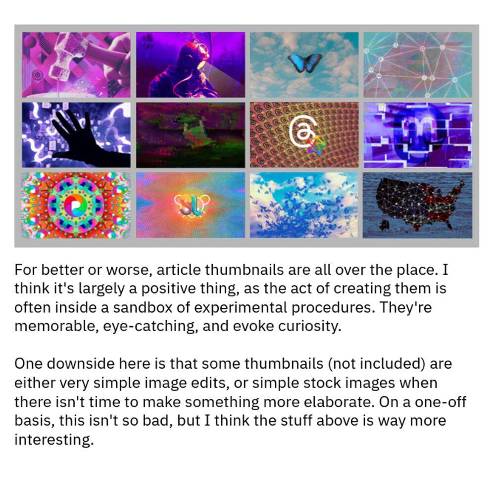
"alt An assortment of thumbnails from various articles, all hand-made, all dramatically different in a number of ways.\n\nText: \"For better or worse, article thumbnails are all over the place. I think it's largely a positive thing, as the act of creating them is often inside a sandbox of experimental procedures. They're memorable, eye-catching, and evoke curiosity.\n\nOne downside here is that some thumbnails (not included) are either very simple image edits, or simple stock images when there isn't time to make something more elaborate. On a one-off basis, this isn't so bad, but I think the stuff above is way more interesting.\"",
"x ffb66b4688810de0cab3c9f0c4d200d80a56d8d9cd55dba472b1fadbfbd2663a",
"size 143956",
"dim 1000x978",
"blurhash |TO3^RnO%MkW%MRk%LWX%M00r]t8t6t7WDt6W.t7-=Roa{n}aej]R%k8WB~pR.fNWAV[ofRkbERj?as;RhS2WFoIaiayWCWAt6W9S5fljYogagfl-;W-WEjbaej]jZoMaf%fSdW?nie-W?axofaf%MX5W?n%WAbIjYoMaf",
"ox 36a98a15ed17e641ff1bef30ceb1f4afac29a79ba97d624aa0f3dd5f55ff5241"
],
[
"imeta",
"url https://image.nostr.build/4617fd9aa9375e787852de9ae5aa37e44cd698d99aa3a156cb4aa33ebe3e1a27.jpg",
"m image/jpeg",
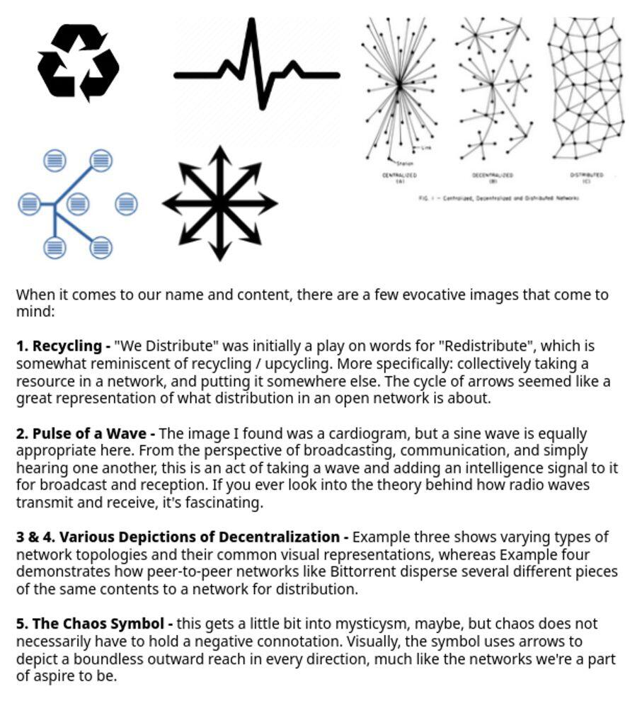
"alt A variety of different symbols, including a recycling logo, an ekg symbol, various decentralized network symbols, the Librecast symbol, and the chaos symbol.\n\nThe words are too long to fit in the alt text, sorry.",
"x dcb9116f4981f1330239902e26a4767595952bb7132e7a004c45402497773fc8",
"size 130990",
"dim 907x1000",
"blurhash {4RfkB00-;kD?bIU%2-:~qt8IVxuRjWBIT%M%Mt7IURjM{t7t7%M00xZs,ITWBxu-;xuxtxtRiD%M{t8%Mxu%MM{WBs:WBWBt8t7_3IUNGxut7RiM{j?D%D*xv%MxuM{RiWB.8WCWVxut8RjM{RP",
"ox 4617fd9aa9375e787852de9ae5aa37e44cd698d99aa3a156cb4aa33ebe3e1a27"
]
],
"content": "Working on a #design study for nostr:npub1w9wuqc3s6lr25c4sgj52werj3tngvt43qrccqrher4wvn7tjm32s2ck403's branding and visual language. It’s just a rough draft for now, but it’s fun to think about and sketch out ideas.\n\nI’m a total hobbyist / amateur when it comes to this stuff, but it feels really cool to finally put some kind of foundation down.\n https://image.nostr.build/aab94e7aca1b890d86bf81006c547d60fe4256001c30461bfbb15c277a2832aa.jpg\n https://image.nostr.build/5b65055a1adaf3e3141c8fdb16c5eb3c0781743e6e296198ada33e291650fd97.jpg\n\nhttps://image.nostr.build/36a98a15ed17e641ff1bef30ceb1f4afac29a79ba97d624aa0f3dd5f55ff5241.jpg\n\nhttps://image.nostr.build/4617fd9aa9375e787852de9ae5aa37e44cd698d99aa3a156cb4aa33ebe3e1a27.jpg",
"sig": "a644f6f1bfb5185c12ef0404ba483e9c5281ca8fc438d5a61935f710a1d6d48ddcd3f0b60bd65b7c46ac87921612a35156fafa8ac2f216a5d8dc146f731e5f87"
}
