vgwsom on Nostr: This post is mostly analytical, to briefly address a clear difference and ...
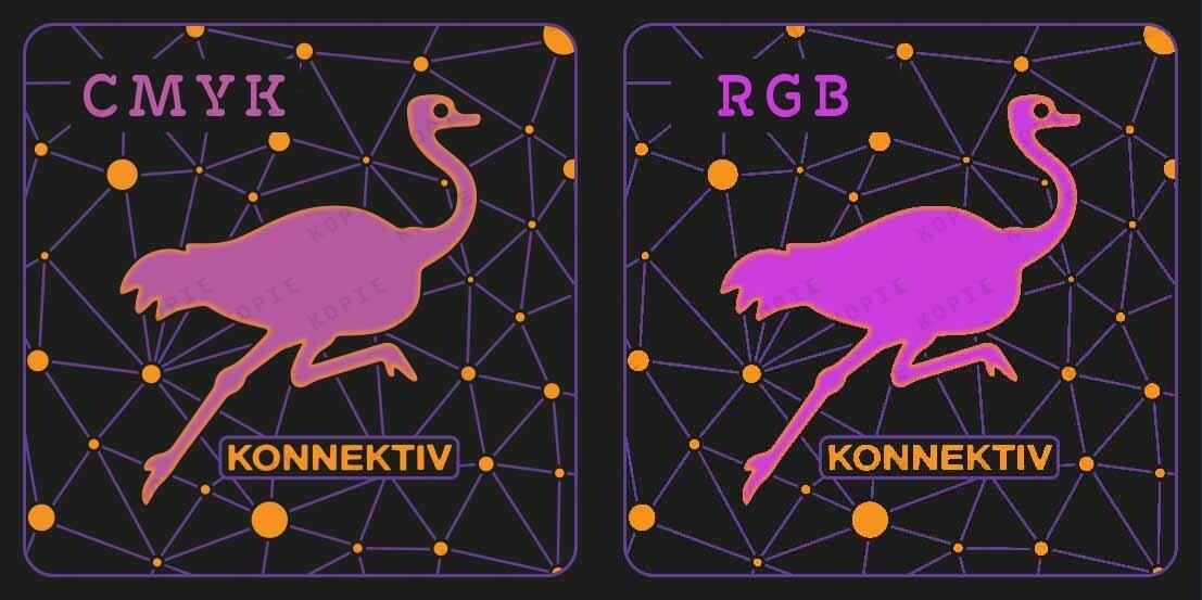
This post is mostly analytical, to briefly address a clear difference and representation between CMYK and RGB colours.
Working with both turns out to be quite fun. However, we must be very careful when making decisions, since it depends a lot on whether we want to print the graphic, or whether it will remain online and on devices.
The image shared here today makes a good visual reference about the two different results.
At the same time, we promote through this post, one of our most recent logo designs: “Purple Konnektiv”.
About the procedure:
Inspired and supported first and foremost by an interesting community and a variety of designs which can be seen through Nostr, we opted to “grab an ostrich, cut its throat and insert a head "with more brains" in it 😂 ” The dots in the background represent ⚡️the Lightning Network and its connectors⚡️ The original logo excludes nomenclature regarding colours.
Other versions of the same logo in other colours will probably appear over time. For this post we have returned to one of the versions with more contrast.
#Logo #LogoDesign #Nostr #DACH #PurpleKonnektiv #NostrCommunity #connections #DACH #Community
Published at
2024-10-09 12:39:06Event JSON
{
"id": "0d2a0f32c47563e8a50e022200745587e148df93528106c852074c39aa6fd898",
"pubkey": "ef7d11a2c9b1d916a02b330db952d2eb4e5a3cd2b1f9e795a42bce2e4725aa04",
"created_at": 1728477546,
"kind": 1,
"tags": [
[
"t",
"logo"
],
[
"t",
"logodesign"
],
[
"t",
"nostr"
],
[
"t",
"dach"
],
[
"t",
"purplekonnektiv"
],
[
"t",
"nostrcommunity"
],
[
"t",
"connections"
],
[
"t",
"community"
]
],
"content": "https://i.nostr.build/KFmE4KGCnn9ZUb0M.jpg\nThis post is mostly analytical, to briefly address a clear difference and representation between CMYK and RGB colours.\n\nWorking with both turns out to be quite fun. However, we must be very careful when making decisions, since it depends a lot on whether we want to print the graphic, or whether it will remain online and on devices.\n\nThe image shared here today makes a good visual reference about the two different results.\n\nAt the same time, we promote through this post, one of our most recent logo designs: “Purple Konnektiv”.\n\nAbout the procedure:\nInspired and supported first and foremost by an interesting community and a variety of designs which can be seen through Nostr, we opted to “grab an ostrich, cut its throat and insert a head \"with more brains\" in it 😂 ” The dots in the background represent ⚡️the Lightning Network and its connectors⚡️ The original logo excludes nomenclature regarding colours.\n\nOther versions of the same logo in other colours will probably appear over time. For this post we have returned to one of the versions with more contrast.\n\n#Logo #LogoDesign #Nostr #DACH #PurpleKonnektiv #NostrCommunity #connections #DACH #Community",
"sig": "f1d7ca2095bdd2185957c3088ec855e8092b3436bc3b774daa4c7f418d147571ff139c20d917eecab32c0f7676d6d677999610b8ce4bb15c6561a62868b2f903"
}