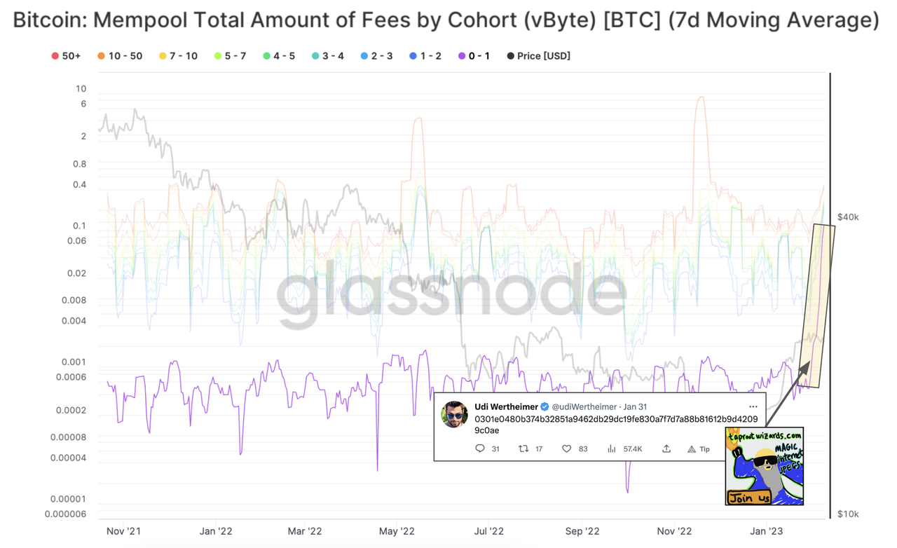
Austin on Nostr: Can anyone help me understand this chart? It looks like since inscriptions got ...
Can anyone help me understand this chart?
It looks like since inscriptions got popular, the total amount of fees for the smallest cohort (by vByte) have increased to be, roughly, on par with the other cohorts. Previously, there was a clear separation.
Wat mean?

Published at
2023-02-09 19:39:36Event JSON
{
"id": "870a7d237df3ef5361af14b2b38f47999b6e2afb52ca6b815e576e386f73ae2c",
"pubkey": "e5dddb158e79b568d10d8d5779aa98c766fcfcdeb63206b5567ebf1a590c8150",
"created_at": 1675971576,
"kind": 1,
"tags": [],
"content": "Can anyone help me understand this chart?\n\nIt looks like since inscriptions got popular, the total amount of fees for the smallest cohort (by vByte) have increased to be, roughly, on par with the other cohorts. Previously, there was a clear separation.\n\nWat mean?\n\nhttps://i.postimg.cc/wTCfV5dG/vbyte.png",
"sig": "81e4f7a24a9f4c0beb9b1d895256bb1b00dafeb9471354acb9e02c110ba78a0f520c41478580e9a9a3c51e0719babac8a47e471a16d2e677ce1c4e0f33c55d26"
}


