GBKS on Nostr: Thanks. I very intentionally designed it the way it is, in order to run several Nostr ...
Thanks. I very intentionally designed it the way it is, in order to run several Nostr concepts past users, while never pressuring them into actually acting on them. So they at least have it in the back of their heads for the future.
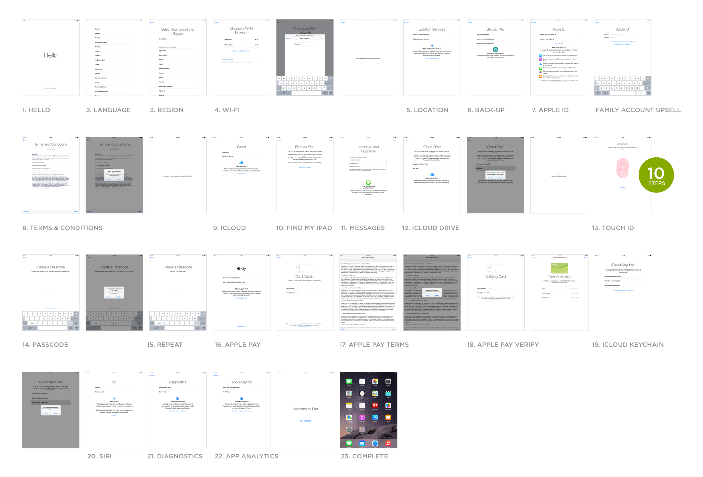
If you look at the onboarding of something like iOS (

), you also go through tons of screens. Each one is focused on a single thing, and afterwards you're really well set up for your future use and don't really have to putz around with basic settings that much anymore.
I totally understand the desire to just cut everything and drop people directly into some UI, but I don't think we're always well served by that. All the social-media focused Nostr apps already do that. And then you have the problem of having to bring the basic concepts back up with users later, sometimes to their surprise.
With Nosta, my idea was to be upfront. Obviously debatable whether that's the best approach or not, and maybe the ideal is somewhere in the middle, but that was my thinking.
Also, I really need to find way more time to work on it (also, it's open-source, so contributions are welcome). So much to do there to make it better. Thanks your your comments, I will note them down and think about them more.
Published at
2024-04-09 13:08:30Event JSON
{
"id": "dee47ea6159a55e48c0951a79b2a4030a5700e88dc233f32f54f6a06dcc64a0a",
"pubkey": "b731e7fbde5c192d793ff520a6ec91f6965f5d8fa1b64e12171089a65e540525",
"created_at": 1712668110,
"kind": 1,
"tags": [
[
"e",
"337e8ffb7cb6bede72cbbe05c0a4c7268685b259223f006b7d0f84189add8d72",
"wss://relay.westernbtc.com",
"root"
],
[
"p",
"3bf0c63fcb93463407af97a5e5ee64fa883d107ef9e558472c4eb9aaaefa459d"
]
],
"content": "Thanks. I very intentionally designed it the way it is, in order to run several Nostr concepts past users, while never pressuring them into actually acting on them. So they at least have it in the back of their heads for the future.\n\nIf you look at the onboarding of something like iOS (https://static.lukew.com/ipad_start2014.png), you also go through tons of screens. Each one is focused on a single thing, and afterwards you're really well set up for your future use and don't really have to putz around with basic settings that much anymore.\n\nI totally understand the desire to just cut everything and drop people directly into some UI, but I don't think we're always well served by that. All the social-media focused Nostr apps already do that. And then you have the problem of having to bring the basic concepts back up with users later, sometimes to their surprise.\n\nWith Nosta, my idea was to be upfront. Obviously debatable whether that's the best approach or not, and maybe the ideal is somewhere in the middle, but that was my thinking.\n\nAlso, I really need to find way more time to work on it (also, it's open-source, so contributions are welcome). So much to do there to make it better. Thanks your your comments, I will note them down and think about them more.",
"sig": "a6d47b809219302ffec222cf9a3ab23462028af5e3baf772aa82f5abe34b76119fbad453301619d88e8f810b94dcac17e0e94f44ac8e7cd75de8d79a4a2275ec"
}
 ), you also go through tons of screens. Each one is focused on a single thing, and afterwards you're really well set up for your future use and don't really have to putz around with basic settings that much anymore.