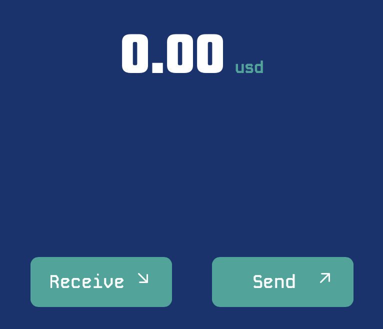
Marks on Nostr: UX thoughts: Arrows are common in wallets. Yes, "Receive" means money is coming down ...
UX thoughts:
Arrows are common in wallets. Yes, "Receive" means money is coming down to me. However, down arrow can also mean balance is going down. And where the button sits on the page, Receive is pointing away from my balance.
I wonder if arrows are the right design pattern.

Published at
2024-06-14 16:09:52Event JSON
{
"id": "f167e4186c9afbaf5e8a1d3197432b24700654b3f2166a7d48dd0fe333863675",
"pubkey": "8ea485266b2285463b13bf835907161c22bb3da1e652b443db14f9cee6720a43",
"created_at": 1718381392,
"kind": 1,
"tags": [
[
"imeta",
"url https://i.nostr.build/AaXVo.jpg",
"blurhash eA5sTut7DjM|w3*%ofE1NG%z.kofIVRkrta2a|a{f6oyH@WBxus:S1",
"dim 766x658"
],
[
"r",
"https://i.nostr.build/AaXVo.jpg"
]
],
"content": "UX thoughts:\n\nArrows are common in wallets. Yes, \"Receive\" means money is coming down to me. However, down arrow can also mean balance is going down. And where the button sits on the page, Receive is pointing away from my balance.\n\nI wonder if arrows are the right design pattern. https://i.nostr.build/AaXVo.jpg ",
"sig": "2e3ecdafe14f39cdac8b855d36f444c08fec5a9b42a64d27c45a83eb0cd91f4ac16be2622b8a73a9086fd0ec0f79322e513744e81d9763fc1046ba72f4d5b7e4"
}

