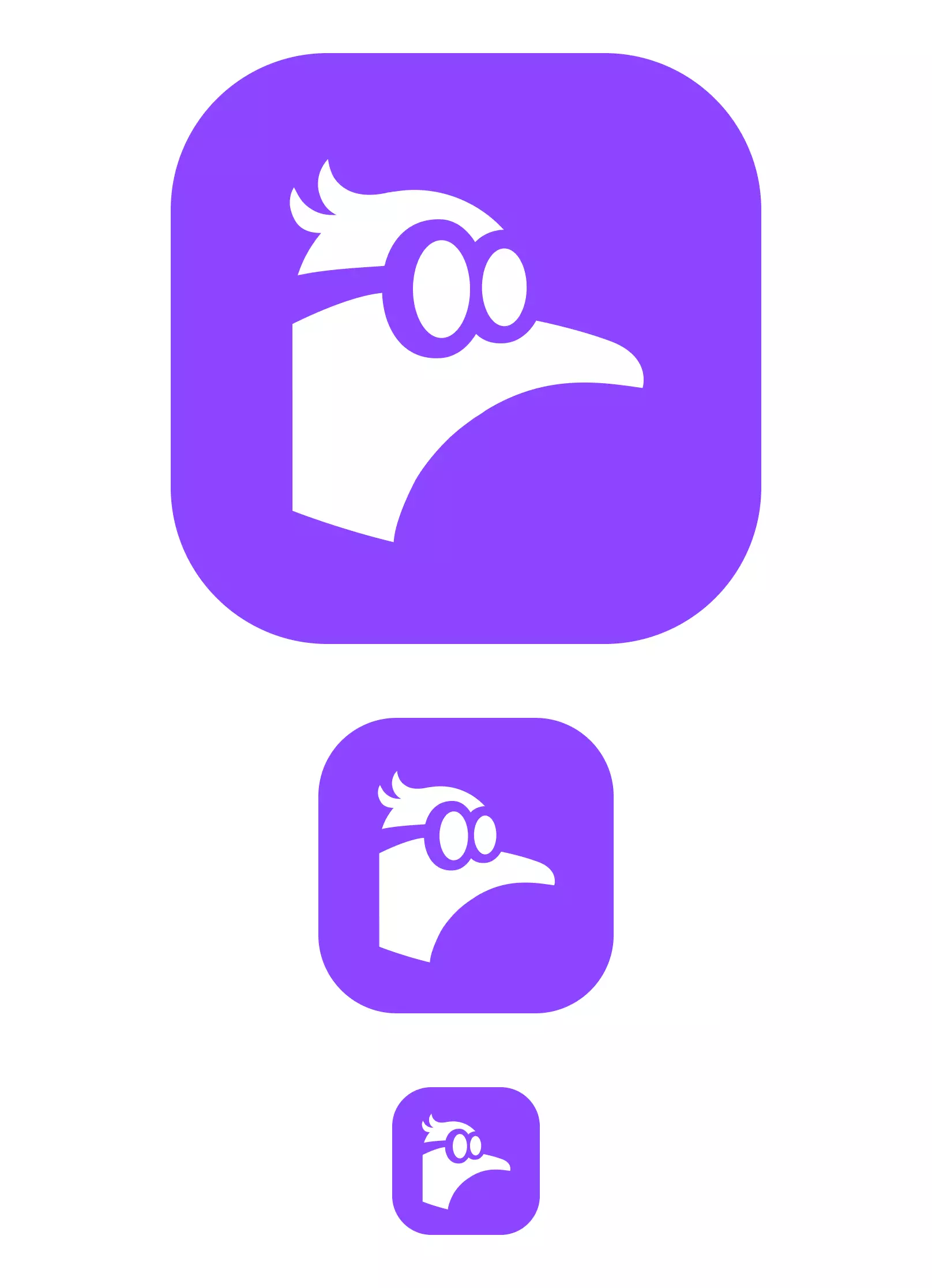
Karnage on Nostr: What I like about this logo: 1. It's simple 2. It's bold, it looks great when scaled, ...
What I like about this logo:
1. It's simple
2. It's bold, it looks great when scaled, small or large, unlike some ostrich logos with tiny legs.
3. It's not generic or boring - think "N" or nodes... those are easily forgettable.
4. It works on any color
5. It works in reverse. If you put this on a glass, you can make out the logo from the other side and still be able to tell what it is.
6. It's quirky, nerdy and a bit humorous. I find this close to the attributes of Nostr - a nerdy name with nerdy concepts but still represents fun and great people.
7. It's a bit playful - fitting for a social protocol
8. Easy to visualize and remember. Nostr = Nerdy bird. The O's could symbolize (O)strich, and once people connect Nostr + Ostrich = Nostrich, it's even more fun.
9. It doesn't take itself too seriously. Some logos try too hard imo and are easily forgettable.
Starting to like it. I think it could work. Credit to whoever made it, hopefully they created it from scratch.
Published at
2024-01-12 03:04:42Event JSON
{
"id": "f8832ca3226cbbc94c5339c3b24333cafd8c80005dc6adbf76c3b25b2cfe8842",
"pubkey": "1bc70a0148b3f316da33fe3c89f23e3e71ac4ff998027ec712b905cd24f6a411",
"created_at": 1705028682,
"kind": 1,
"tags": [
[
"q",
"9fb9c722b99b3de725fbf218137d73eae155390079f31ee14a245ba06ae8ec93",
"wss://nostr.wine/"
]
],
"content": "What I like about this logo:\n\n1. It's simple\n2. It's bold, it looks great when scaled, small or large, unlike some ostrich logos with tiny legs. \n3. It's not generic or boring - think \"N\" or nodes... those are easily forgettable. \n4. It works on any color\n5. It works in reverse. If you put this on a glass, you can make out the logo from the other side and still be able to tell what it is. \n6. It's quirky, nerdy and a bit humorous. I find this close to the attributes of Nostr - a nerdy name with nerdy concepts but still represents fun and great people. \n7. It's a bit playful - fitting for a social protocol\n8. Easy to visualize and remember. Nostr = Nerdy bird. The O's could symbolize (O)strich, and once people connect Nostr + Ostrich = Nostrich, it's even more fun. \n9. It doesn't take itself too seriously. Some logos try too hard imo and are easily forgettable.\nnostr:note1n7uuwg4env77wf0m7gvpxltnats42wgq08e3ac22y3d6q6hgajfsw4v777",
"sig": "ce27090a24adf2896165bc12da6a1076892152125554956a6879a52d66cfcc843f22c4aed5f4f8b5d41ae5e3bda648d08e890b5ce022a1598c043083fba507eb"
}